Transform Your Space: 13 Elegant Color Schemes to Elevate Your Home

Are you looking to elevate your home with 13 elegant color schemes? The right color palette can transform any space, creating a stylish and inviting atmosphere.
In this article, we’ll explore a variety of color schemes that not only enhance your home’s aesthetic but also reflect your unique personality and taste.
Get ready to dive into some inspiring ideas that will breathe new life into your living spaces!
Understanding Color Theory

Color theory forms the backbone of any design project.
It helps you choose colors that not only look great but also create the mood you want in your home. Here’s a quick dive into the basics.
The Color Wheel
The color wheel shows how colors relate to one another. It consists of three main categories:
- Primary Colors: Red, Blue, Yellow. These colors can’t be made by mixing others.
- Secondary Colors: Green, Orange, Purple. These are created by mixing two primary colors.
- Tertiary Colors: Combinations of primary and secondary colors, like Red-Orange or Blue-Green.
Color Harmonies
Using colors that work well together creates a cohesive look. Here are some common color harmonies:
- Complementary Colors: Opposite on the color wheel. They create high contrast and vibrant looks. Example: Blue and Orange.
- Analogous Colors: Next to each other on the wheel. They create a serene and comfortable feel. Example: Blue, Blue-Green, and Green.
- Triadic Colors: Three colors evenly spaced on the wheel. They offer a balanced yet colorful palette. Example: Red, Yellow, and Blue.
Color Properties
Colors have three main properties to consider:
- Hue: The actual color (red, blue, green).
- Saturation: The intensity of the color. Bright colors have high saturation, while muted colors have low saturation.
- Value: The lightness or darkness of a color. Mixing a color with white lightens it (tint), while mixing with black darkens it (shade).
Psychological Impact
Colors can affect mood and perception. Consider these general feelings associated with colors:
- Red: Energy, passion, and action.
- Blue: Calmness, trust, and serenity.
- Yellow: Happiness, optimism, and warmth.
- Green: Nature, balance, and renewal.
- Purple: Luxury, creativity, and mystery.
Understanding these elements helps you select colors that enhance your home’s beauty and reflect your personal style.
Use this knowledge to transform your space with elegance.
Choosing the Right Base Color

Picking the right base color sets the mood for your entire space.
It acts as the foundation for your design, influencing how other colors pop. Here are some tips to help you choose:
- Consider the Room’s Purpose
Different rooms evoke different feelings. Think about how you want to feel in each space.
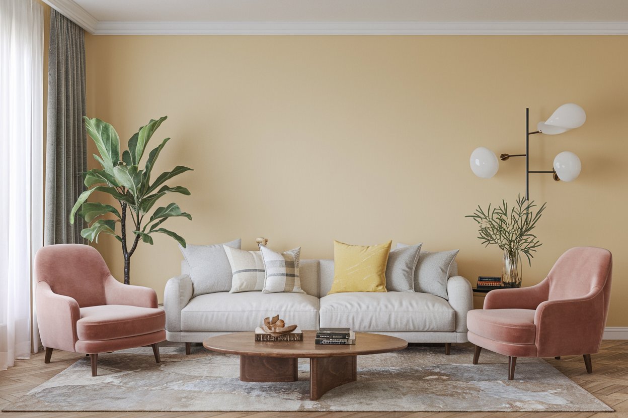
- Living Room: Warm and inviting colors like soft beiges or light grays work well.
- Bedroom: Go for calming colors like gentle blues or greens to promote relaxation.
- Kitchen: Bright and cheerful shades like sunny yellows or crisp whites can energize the space.
- Lighting Matters
Natural and artificial light changes how colors appear. Test your base color in different lighting.
- Daylight: Colors can look cooler and brighter.
- Evening: Colors may warm up and appear softer.
- Size of the Room
Base colors can alter the perception of space.
- Small Rooms: Lighter colors make spaces feel larger and more open.
- Large Rooms: Darker shades can create a cozy atmosphere.
- Style Consistency
Your base color should align with your overall style.
- Modern: Neutral tones like gray or white fit well.
- Traditional: Rich, warm colors like deep reds or browns work nicely.
- Test Samples
Always paint swatches on the wall. This helps you see how the color interacts with your furniture and décor. - Think About the Flow
Ensure your base color flows well with adjacent rooms. A cohesive palette makes your home feel harmonious.
Incorporating these tips helps you choose a base color that reflects your personal style while enhancing your home’s ambiance.
Trust your instincts and have fun experimenting with different shades.
Monochromatic Magic: One Color, Many Shades

Monochromatic color schemes focus on one color, but play with different shades, tints, and tones.
This approach creates a harmonious look that can elevate any space. Using various shades of the same color adds depth without overwhelming the senses.
Choosing Your Base Color
- Identify Your Desired Mood
- Blue promotes calmness and tranquility.
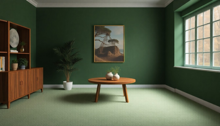
- Green brings freshness and vitality.
- Red energizes and excites.
- Select Your Base Color
- Pick a color that resonates with you and fits your space.
Exploring Shades and Tints
- Shades: Darker versions of your base color. They create contrast and depth.
- Tints: Lighter versions of your base color. They offer softness and a light feel.
Creating Visual Interest
Use varying shades and tints strategically:
- Accent Walls: Paint one wall a darker shade to create a focal point.
- Textiles: Incorporate cushions, throws, and rugs in different shades.
- Art and Decor: Choose artwork that includes your base color in various tones.
Examples of Monochromatic Color Schemes
| Base Color | Shades/Tints | Suggested Use |
|---|---|---|
| Blue | Navy, Sky | Living room, bedroom |
| Green | Olive, Mint | Kitchen, bathroom |
| Gray | Charcoal, Light Gray | Office, hallway |
Tips for Success
- Balance is Key: Mix dark and light shades for a well-rounded look.
- Texture Matters: Use different materials to add interest. Think wood, metal, and fabric.
- Layering: Layer various shades in different elements, like furniture and decor, to avoid a flat appearance.
Monochromatic magic transforms spaces by creating a cohesive and sophisticated feel.
Enjoy the simplicity and elegance of one color, beautifully expressed in many shades.
Complementary Colors: Bold and Beautiful

Complementary colors make a statement. They sit opposite each other on the color wheel, creating a striking contrast.
This pairing adds vibrancy and energy to any space. Here are some standout combinations that can elevate your home:
- Blue and Orange: This duo brings a lively feel. Use deep navy with bright orange accents for a sophisticated touch.
- Red and Green: Perfect for a festive vibe. Pair a rich crimson with soft sage to balance intensity with calmness.
- Purple and Yellow: A royal combination. Use dark plum walls with bright yellow accessories for a bold look.
- Teal and Coral: This refreshing mix feels modern. Combine deep teal furniture with coral pillows for a chic contrast.
- Black and White: A classic choice. This timeless pairing adds elegance and can suit any style, from minimalist to vintage.
Tips for Using Complementary Colors
- Choose One Dominant Color: Make one color the star of the show. Use it on walls or large furniture pieces.
- Add Accents: Use the second color in smaller touches, like throw pillows, artwork, or decor items.
- Balance Brightness: If one color is vibrant, balance it with softer shades of the other. This prevents overwhelming the space.
- Test Samples: Always try paint or fabric samples in your home. Lighting changes how colors appear, so see them in your space first.
Color Pairing Examples
| Dominant Color | Accent Color | Ideal Use Case |
|---|---|---|
| Navy | Orange | Living room or office |
| Crimson | Sage | Dining room or kitchen |
| Plum | Yellow | Bedroom or playroom |
| Teal | Coral | Bathroom or hallway |
| Black | White | Any room for timeless style |
Complementary colors can transform your home. Use them wisely to create a bold yet beautiful environment that feels inviting and dynamic.
Analogous Colors: A Harmonious Blend

Analogous colors sit next to each other on the color wheel. They create a soothing and cohesive look, perfect for any room in your home.
Using these colors can enhance the overall vibe and bring a sense of unity to your space.
Key Features of Analogous Colors
- Natural Flow: These colors naturally blend, making transitions smooth.
- Visual Comfort: They evoke feelings of calm and relaxation.
- Versatility: Works well in various styles, from modern to traditional.
Popular Analogous Color Schemes
- Blue, Blue-Green, Green
- Perfect for coastal themes.
- Invokes tranquility and freshness.
- Red, Red-Orange, Orange
- Ideal for vibrant and energetic spaces.
- Adds warmth and excitement.
- Yellow, Yellow-Green, Green
- Brightens up rooms with a cheerful ambiance.
- Invites a lively yet relaxed feel.
- Purple, Blue-Purple, Blue
- Creates a rich and luxurious atmosphere.
- Great for bedrooms or home offices.
How to Use Analogous Colors
- Accent Walls: Paint one wall in a bold shade while keeping the others in softer tones from the same scheme.
- Decor Items: Mix and match cushions, rugs, and artwork that reflect your chosen color palette.
- Furniture Choices: Select pieces that embody the colors, like a blue sofa paired with green throw pillows.
Tips for Success
- Stick to three colors for balance.
- Use one dominant color and the others as accents.
- Consider the lighting in your space; natural light can change how colors appear.
Using analogous colors can transform your home into a harmonious haven.
By carefully selecting your palette, you create an inviting and stylish environment that feels cohesive and well thought out.
Neutrals with a Twist

Neutrals are a classic choice for any home, but adding a twist can make your space feel fresh and inviting. Here are some ideas to elevate your neutral palette:
- Warm Greys: Swap cool greys for warm tones. This creates a cozy environment. Pair warm greys with soft whites for a balanced look.
- Beige and Blush: Mixing beige with blush adds a subtle hint of color. This combination feels soft and feminine. Use blush in accents like pillows or artwork.
- Muted Greens: Incorporate muted greens like sage or olive. These shades bring a touch of nature indoors. They pair beautifully with white or light wood.
- Charcoal and Gold: Charcoal grey offers sophistication. Add gold accents for a touch of glam. Think light fixtures or decorative objects.
- Earthy Tones: Combine taupe and terracotta for a grounded feel. This palette works well with natural materials like wood and stone.
Tips for Using Neutrals with a Twist
- Start Small: Introduce new colors through accessories. Use throws, cushions, or rugs to test the waters.
- Layering: Mix different shades of the same color for depth. Layering creates texture and visual interest.
- Accent Walls: Paint one wall in a bolder shade. This can create a focal point without overwhelming the room.
- Artwork and Decor: Use art with pops of color. It can tie the whole room together and make neutrals pop.
- Textures Matter: Incorporate various textures. Use soft fabrics, shiny metals, and rough woods to add dimension.
Color Combinations
| Neutral Base | Twist Color | Best Accents |
|---|---|---|
| Warm Grey | Blush | Soft White, Gold |
| Beige | Muted Green | Cream, Light Brown |
| Charcoal | Deep Blue | Silver, White |
| Taupe | Terracotta | Olive, Natural Wood |
These combinations prove that neutrals don’t have to be boring. With a little creativity, you can create an elegant and inviting space that feels uniquely yours.
Accent Colors: Adding Pops of Personality

Accent colors breathe life into your home. They offer a fun way to showcase your personality and style without overwhelming the space.
Here’s how to effectively use accent colors to elevate your home decor.
Choosing Your Accent Color
- Identify Your Base Colors
Start with a neutral palette. This provides a calming backdrop for your accent colors. Think whites, grays, or beiges. - Pick a Color That Speaks to You
Choose an accent color that resonates with your personality. Whether it’s a bold red or a soft teal, make sure it reflects your vibe. - Consider the Mood
Different colors evoke different feelings. Bright colors like yellow or orange create energy, while blues and greens promote calmness.
Where to Use Accent Colors
- Throw Pillows
Add a splash of color on your couch or bed with vibrant throw pillows. They’re easy to switch out as trends change. - Artwork
Hang colorful art pieces on your walls. They can serve as a conversation starter while introducing your chosen accent color. - Rugs
A bold rug can anchor a room and add depth. It’s a great way to incorporate color without committing to paint. - Accent Furniture
Consider a colorful chair or side table. This can create a focal point in a room and draw attention.
Tips for Balancing Accent Colors
- Limit Your Palette
Stick to two or three accent colors. This keeps the space cohesive and avoids a chaotic look. - Use Patterns Wisely
Patterns can add visual interest. Opt for patterned fabrics or wallpaper that incorporate your accent color. - Mix Textures
Combine various materials like wood, metal, and fabric in your accent colors. This adds dimension and richness to your decor.
Examples of Popular Accent Colors
- Coral
Adds warmth and energy. Great for living rooms and bedrooms. - Navy Blue
Offers sophistication. Works well in dining areas or home offices. - Mustard Yellow
Brightens up neutral spaces. Perfect for kitchens or playrooms.
Experiment with these ideas and let your home reflect your unique style through accent colors.
Seasonal Color Schemes: Refreshing Your Space

Changing your color scheme with the seasons can give your home a fresh look.
Each season brings unique colors that can energize your space. Here’s how to embrace seasonal palettes:
Spring
- Colors: Soft pastels like blush pink, light lavender, and mint green.
- Tips: Use pastel cushions and throws. Add floral prints for a cheerful vibe.
Summer
- Colors: Bright and vibrant shades like sunny yellows, ocean blues, and coral.
- Tips: Incorporate bright artwork and colorful rugs. Use light fabrics for curtains to let in natural light.
Fall
- Colors: Warm tones such as burnt orange, deep reds, and golden yellows.
- Tips: Swap out light linens for cozy textures. Add accents like pumpkins and autumn leaves for a seasonal touch.
Winter
- Colors: Cool hues like icy blues, rich emeralds, and crisp whites.
- Tips: Use darker throws and blankets. Incorporate metallics for a touch of holiday glam.
Quick Color Change Ideas
- Accent Walls: Paint one wall in a seasonal color to create a focal point.
- Accessories: Switch out cushions, curtains, and decor items to match the season.
- Artwork: Rotate artwork that reflects seasonal themes.
Color Combinations to Try
| Season | Primary Color | Secondary Color | Accent Color |
|---|---|---|---|
| Spring | Blush Pink | Mint Green | Soft Yellow |
| Summer | Ocean Blue | Coral | Bright White |
| Fall | Burnt Orange | Deep Red | Gold |
| Winter | Icy Blue | Emerald Green | Silver |
Embracing seasonal color schemes keeps your home feeling fresh and inviting. It’s an easy way to reflect nature’s beauty while adding your personal touch.
Textures and Patterns: Enhancing Color Impact
Textures and patterns play a crucial role in boosting color impact in your home.
They add depth, interest, and sophistication to any space. Here’s how you can elevate your color schemes using textures and patterns.
Mixing Textures
Combining different textures creates a visually dynamic environment. Here are some popular textures to consider:
- Smooth: Think sleek finishes like glass or polished wood.
- Rough: Incorporate materials like stone or raw wood for natural warmth.
- Soft: Use fabrics like velvet or linen to bring comfort and coziness.
- Shiny: Metallics and glossy surfaces can add a touch of glam.
Choosing Patterns
Patterns can transform the mood of a room. They can either complement or contrast your color scheme. Consider these types of patterns:
- Geometric: Clean lines and shapes create a modern vibe.
- Floral: Soft, romantic designs add warmth and charm.
- Stripes: Vertical stripes can make a space feel taller, while horizontal ones can widen it.
- Abstract: Unique designs allow for personal expression and creativity.
Layering Techniques
Layering textures and patterns enhances visual interest. Try these techniques:
- Accent Pillows: Choose pillows with different textures and patterns for your sofa.
- Area Rugs: Layer rugs of various materials to define spaces and add warmth.
- Wall Art: Mix framed artwork with textured pieces like woven or metal art.
- Curtains: Use patterned curtains with solid-colored drapes for depth.
Color Considerations
While combining textures and patterns, keep color in mind. Stick to a cohesive palette to maintain harmony. Here’s a simple guideline:
- Monochromatic: Use different shades of one color for a sophisticated look.
- Analogous: Choose colors next to each other on the color wheel for a harmonious feel.
- Complementary: Pair colors opposite each other for a bold contrast.
Textures and patterns can elevate your home’s aesthetic.
They help you express your style while enhancing the colors you choose. Embrace creativity, and let your space reflect your personality.
Maintaining Balance: Tips for Color Placement
Finding the right balance in color placement makes your space feel cohesive and inviting. Here are some tips to help you achieve that elegant look.
- Use the 60-30-10 Rule
This classic rule helps distribute colors effectively:
- 60%: Dominant color (walls, large furniture)
- 30%: Secondary color (sofas, curtains)
- 10%: Accent color (decor, art)
- Create Zones
Use color to define spaces within an open layout. Different colors can help separate areas like living rooms and dining spaces. - Consider the Flow
Ensure colors transition smoothly from one room to another. Use similar shades or tones to create harmony throughout your home. - Choose Complementary Colors
Pick colors that sit opposite each other on the color wheel for contrast. This adds vibrancy without overwhelming the space. - Test with Samples
Before committing, paint swatches on your walls. Observe how colors look in different lighting throughout the day. - Incorporate Neutrals
Neutrals ground your color scheme. Use them in large furniture pieces or walls to balance bolder colors. - Vary Shades and Tones
Use different shades of the same color for depth. Lighter tones can make a space feel larger, while darker tones add intimacy. - Accent with Accessories
Use pillows, rugs, or artwork to introduce accent colors. This allows flexibility in changing your color scheme without major renovations. - Keep the Ceiling in Mind
A light color on the ceiling can create the illusion of height. Darker colors can make a room feel cozier. - Natural Light Impact
Consider how natural light affects colors. Bright, sunny rooms might handle bold colors better than darker spaces. - Limit the Palette
Stick to a limited color palette. Too many colors can feel chaotic. Aim for a cohesive look with three to five main colors. - Add Texture
Incorporate different textures to add visual interest. Textured fabrics or materials can elevate a color scheme without needing additional colors. - Personal Touch
Ultimately, choose colors that reflect your personality. Your space should feel like home, so trust your instincts when selecting shades.
Conclusion
Choosing the right color scheme transforms your home and elevates its overall aesthetic. Each of the 13 elegant color schemes discussed offers a unique vibe, allowing you to express your personality and style. From tranquil blues to vibrant reds, these palettes create inviting spaces that reflect comfort and sophistication.
Implementing these color schemes doesn’t require a complete overhaul. Small changes like accent walls, decor pieces, or textiles can make a significant impact. Embrace the colors that resonate with you and watch your home come alive with elegance and charm.


